Located off of Irvine Blvd and Groveland, the Village of Stonegate (Stonegate Overview PDF) offers 5 housing tracts: Santa Clara, Santa Maria, San Mateo, San Marcos and Maricopa. Their tagline is “intimate yet connected” and I think that’s an accurate portrayal of the area. It seems to be nestled in its own corner but has close access to Woodbury Town Center, Orchard Hills Village Center and is about 15 minutes from the Irvine Spectrum. The housing development is walking distance to Stonegate Elementary School and not far from Sierra Vista Middle School and Northwood High School. Much like the rest of Irvine, the Village of Stonegate is marked by convenience.
Since Santa Clara (Santa Clara Community Overview PDF) is the smallest of the 5 tracts, it’s ideal for singles and couples. The Santa Clara floor plans are referred to as “flats” which in my opinion is a euphemism for small. However, after viewing the models I think “flats” is an appropriate description and they did a nice job working with the space. The smallest of the 3 floor plans (All floor plans available here) is Residence 1, which is 1,129 square feet. In retrospect it’s not a lot of space, but somehow it feels roomy. I think it can be attributed to the idea of the “great room” which is heavily prominent throughout all three residences. The great room gives you the freedom to define your living space. I can appreciate the benefit of unrestricted design, and I think it’s a selling point.
Estimated property taxes and special assessments:
Base Property Tax: 1.05% of sales price
AD Tax: $1,350 per year
CFD Tax: $1,700 per year
Other Taxes: $156 per year
Overall Effective Tax Rate: Approximately 1.9%
The HOA dues are approximately $306 per month, which is comparable to other new developments. After looking at the well-manicured neighborhood, I think you’ll get your money’s worth.
Residence 1
Number of bedrooms: 1 bedroom + den
Number of bathrooms: 1.5
Square footage: 1,129 sq ft
Garage: 1 car
Base price: $339,300
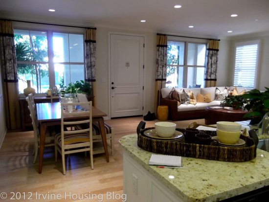
I immediately liked walking through the door into Residence 1. It has a bit of an apartment ambiance to it, but on the flip side there are no stairs to contend with. It’s my feeling that the great room concept forces your furniture placement between the dining and living room spaces. You could comfortably fit a table that seats 6-8 people in the dining space. What I didn’t like about the dining space was that it was smack dab in the middle of a high foot traffic area. It literally borders the entry way. Some creative thinking might alleviate that quality, but I feel like it downgrades the overall attractiveness and makes it more comparable to apartment style living.
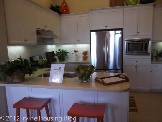
All the residences come with stainless steel appliances as part of the standard kitchen package. The kitchen counter space was workable, but it would’ve been nice to have at least another 1-2 feet of extra countertop. It isn’t a deal breaker. They’ve configured the kitchen countertops to accommodate 2 barstools facing the sink. There’s not a lot of space, but if you’re the grab and go diner, it won’t be an issue for you. I was impressed with the cabinet storage. I think having a designated pantry is a plus. However, the microwave is built into the pantry and sits at waist level. It’s the most awkward spot to put a microwave. It’s like the builders ran out of space and were forced to stick the microwave somewhere, so they built it into the pantry. I’ve never seen anything like it. It’s a conversation piece at best. Access to the one car garage is off the kitchen as well as a door masking the stackable washer and dryer (available as an upgrade).
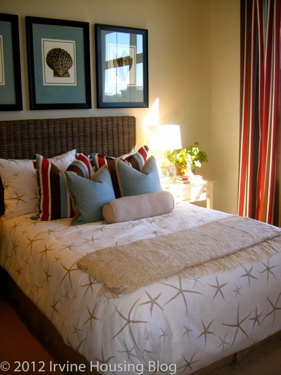
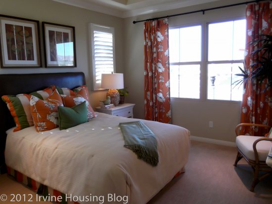
The master bedroom is fairly decent sized. If you strategically configure your bedroom furniture, you could make it comfy and cozy. The bedroom has large windows, which limits wall space, but I’m willing to sacrifice the wall space for a little sunlight. Don’t worry, there’s plenty of wall space for your dresser and you can still mount your television.
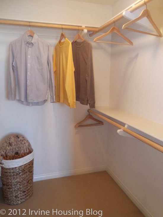
The walk in closet is standard, but there were only bars and shelves on one side with a bunch of empty wall space. That’s an easy fix.
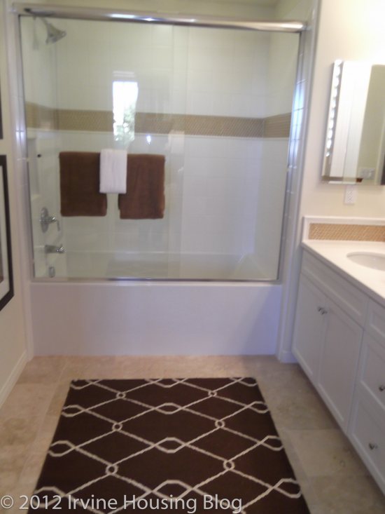
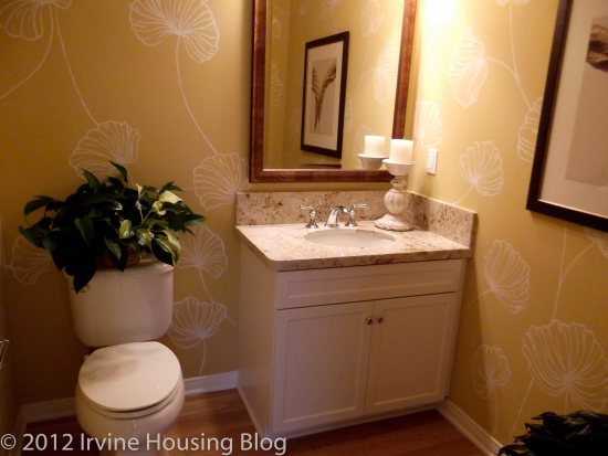
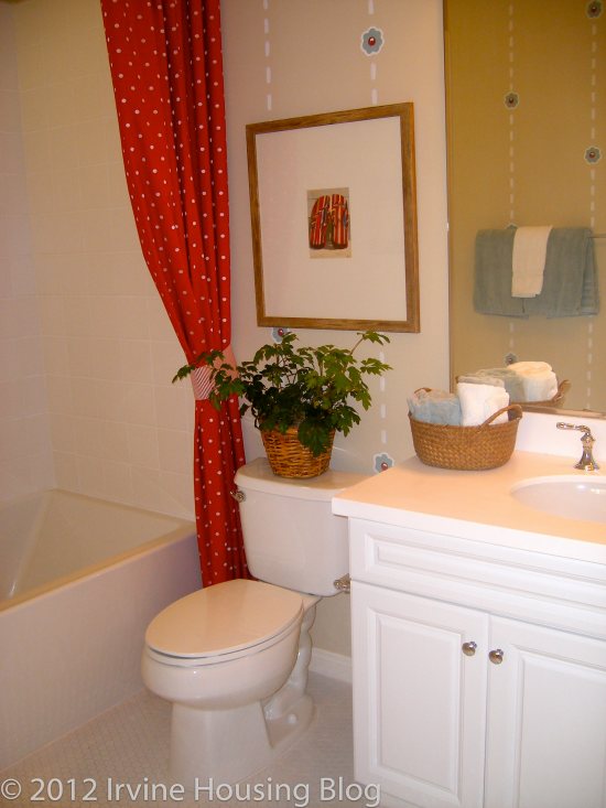
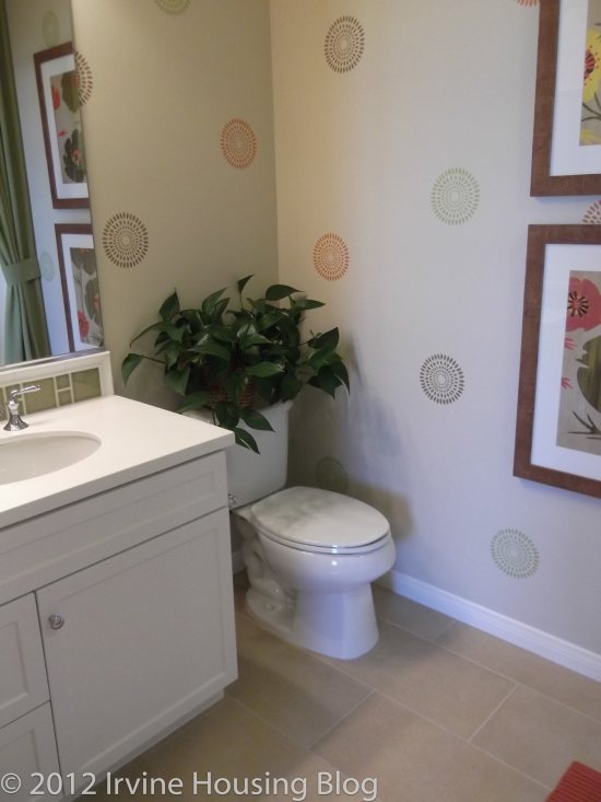
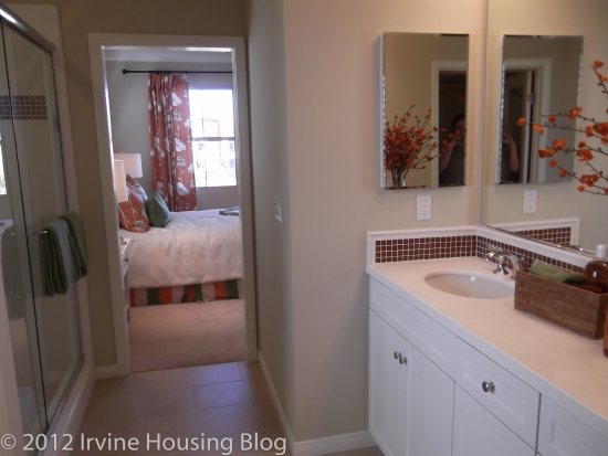
The master bathroom is unimpressive. It’s functional. It has the typical “hallway” feel. There’s a dual sink vanity, a shower/tub combo and the toilet is not separate from the main bath area. They made a valiant attempt to separate the toilet by pushing it back into a recessed corner. It’s disappointing that the shower isn’t separate from the tub. I’d expect to have that feature in newer developments.
Residence 1 advertises the floor plan as 1 bedroom + den. Do not consider turning the den into a bedroom. It won’t work. The space is too small, the closet isn’t functional, and the second bedroom would share a wall with the master bedroom—a big problem in my book. Here’s the kicker: the den (or second bedroom) is only separated from the dining room by wooden shutters. This made me say the big NO to this floor plan.
The wooden shutters give this space no privacy. Unless you’re living by yourself, there’s always going to be a noise factor. This room is sandwiched between the dining room and the master bedroom. I don’t like the idea of having the dinner table so close to the den. It didn’t feel right and I think it created a chasm in the flow of the house.
The guest bathroom has a very small vanity with no counter space. It’s a shower/tub combo. It’s very cookie cutter. This floor plan is advertised as a 1.5 bathroom flat and you definitely feel the .5 in this bathroom. It’s purely functional and lives up to its purpose.
Sorry Residence 1, but you’re off the list. If I’m going to pay $340,000+ for you, I want to feel like I’m living in more than just an apartment with an oddly placed microwave.
Residence 2
Number of bedrooms: 2 bedrooms
Number of bathrooms: 2
Square footage: 1,305 sq ft
Garage: 2 car
Base price: $415,300
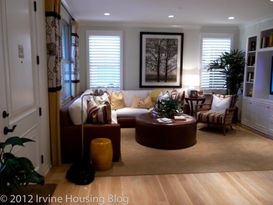
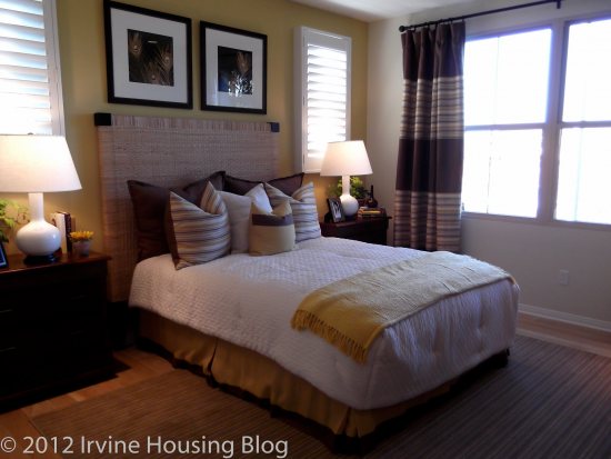
Residence 2 was my favorite floor plan. When I walked through the door I immediately imagined myself coming home from work and walking up the staircase to the comforting view of my home. I LOVED the attractive, bright, open view of the entire space. I almost felt like I was home and upon first glance was ready for move in!
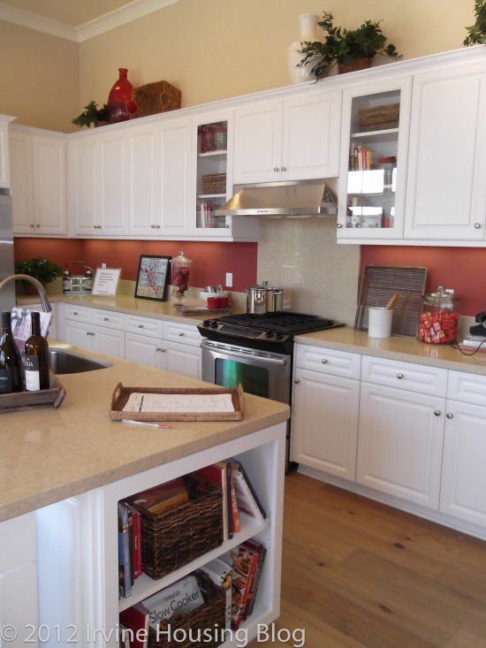
I was really impressed with the kitchen. It’s spacious, plenty of counter and cupboard space, and a nice island with extra storage. The island has a nice stainless steel sink, but you can upgrade to the double wide basin. The model displayed a small built in desk and bookshelf nook. It looks out of place because it feeds off the kitchen countertop. I’d rather nix the desk and have the extra cupboard and counter space. There is no full length pantry, but there’s ample space to store your dry goods.
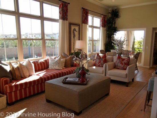
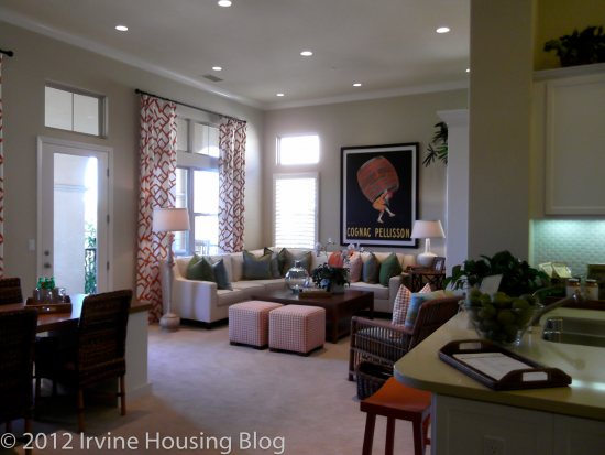
The oversize windows in the living room are what make Residence 2 so inviting. As much as I enjoy the illuminating open concept look and feel of this floor plan, I didn’t like that there is no distinction between the living room and dining areas. This is the negative side to the great room concept. The buyer will have to get creative and define the space. Area rugs can work wonders, and so can well-placed furniture. If you do it right, you and your guests won’t even notice that it is one blended area.
Off the “dining room” is the patio. You can easily fit a table and four chairs out there with a small grill. I like that the patio is immediately off the dining area simply because if you are entertaining a large group of guests, you can open the sliding glass doors and instantly create a connection between the balcony table and the dining room table.
For me, one of the biggest selling points was the bedroom layouts. The bedrooms are on OPPOSITE sides of the house. This is a huge plus. It’s great for privacy. The second bedroom is not very large, but it’s doable. It’s ideal for a roommate situation, or can be used as a child’s bedroom.
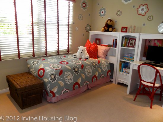
The second bedroom has an ensuite. Granted, it’s a small bathroom, but it’s fully equipped with a shower/tub combo. The vanity has very little counter space, which is a buzz kill for me. If it’s a kid’s room it probably wouldn’t be a problem. On the whole, this bedroom received a passing grade. The only issue with having an ensuite in both bedrooms is the lack of a guest bathroom. Someone in the house will have to keep their bathroom and bedroom clean when guests come over.
The master bedroom is an adequate size and is built to accommodate the typical bedroom furniture setup. The walk in closet is nothing special.
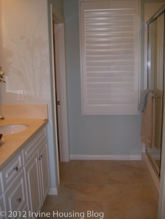
The most depressing and disappointing feature about the master bedroom was that there is no tub in the ensuite. It was nearly perfect: walk-in shower, dual sink vanity, toilet located in a separate room. No tub. Major bummer. I would’ve at least built a shower/tub combo, and the design center might allow the original homeowners to have that option. There is no excuse for not including a tub in the master ensuite.
When looking at the big picture, Residence 2 is a house I’d consider buying. My word of caution is to really determine which upgrades you’d like to invest in. I really loved this house, but the model has the bells and whistles and I had to stop and consider how much extra money I’d have to pump into this place. If all the upgrades are pushing me into the $430s-$450s, I’m going to buy somewhere else. Because this is an open space floor plan, I’d recommend getting hardwood floors. Unless you upgrade the floors, you’ll have a house full of carpet with vinyl in the “wet” areas. I’d also take advantage of the opportunity to upgrade to recessed lighting and crown moulding. Any blinds, shades or shutters in the model are not included in the home, and I think if I was buying the house I’d have them install those features.
Residence 3
Number of bedrooms: 2 bedrooms
Number of bathrooms: 2
Square footage: 1,322 sq ft
Garage: 2 car
Base price: $400,300
Residence 3 was very bland in my opinion. Your living space is upstairs, with access to the garage immediately off the entry way. The top of the stairs brings you immediately into the kitchen with a view of the great room. While it feels like the floor plan is an open concept, there is a wall that sections off the kitchen from the living room. After visiting Residence 2, I wasn’t partial to having an enclosed space. It made the home seem darker to me.
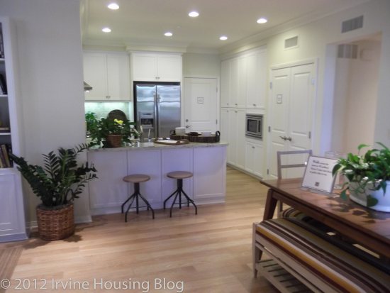
The kitchen is lackluster. Don’t get me wrong—it’s sufficient, but there’s no island and not as much counter space as I’d like to have. There’s definitely enough storage. A couple of the cabinets are high and may require a step stool, but there’s also low storage to help keep frequently used items easy to reach.
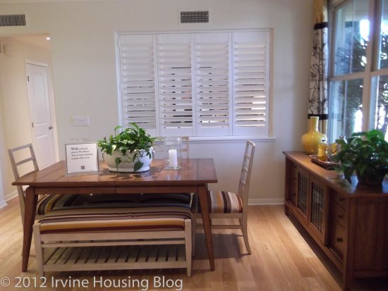
The living room and dining room had more of a distinction than Residences 1 and 2. There was a big enough space between the two areas where I could visualize the separation. I didn’t see an issue with the sizes of the living room/dining room areas. I think they both offer enough space. In the model, they built this strange dining room table contraption and I wasn’t quite sure if I liked it. Built into the wall was a set of recessed bookshelves, and jutting out from the bookshelves was a matching table with coordinating bookshelves on the end caps. It was like a Murphy bed—but a dining room table/storage eyesore. It was the most curious piece of furniture I’ve ever seen! That would be the first thing I’d get rid of. Don’t build that in my house!
The second bedroom was cookie cutter tiny. It’s funny how they always showcase the second bedroom as a nursery! The closet follows suit—unsuitable for an adult occupant.
The guest, or 2nd bathroom has the single sink vanity with 1 cabinet and two drawer storage, with modest counter space. It has a tub/shower combo and the toilet is positioned next to the vanity. Honestly, I don’t want to be overly critical with the second bathroom because it serves its purpose and if you upgrade and get the backsplash you could make it look nice.
The master bedroom received a passing grade. It is large enough for a King bed, a couple of nightstands and dressers, and perhaps a chair if you position things well. It was very bright and had small windows flanking each side of the bed. I liked it.
The master bathroom on the other hand has a narrow, “hallway” type of feel. It has a very large stand-alone shower, but no tub. I’m getting used to disappointment. The vanity is the same as the rest of the floor plans—his and her sinks with ample storage. The bathroom has a decent size walk-in closet. I could really do some damage filling it up. In this particular closet I think I would invest in the upgraded organizer and put the optional mirror on the door. I think there’s enough space to merit investing in these features.
There are a couple of other noteworthy features that I’d like to mention.
- The two car garage contains a big cut out under the stairway for designated storage space. It adds a big plus to the functionality of the home. You can also opt to have the overhead cabinet organizer installed.
- The second point is the balcony. The balcony is wonderful. It’s narrow, but spans the length of the great room. You could get several chairs out there, maybe a few bistro tables and a grill. I imagined myself reading a book out there during the summer.
If I had to sum up the space, I’d give it a 3 out of 5 stars. It’s big enough for a single gal like me. I’d turn the second bedroom into my office. I’d grin and bear it while taking a bath in the guest bathroom tub. Since I don’t spend too much time in the kitchen, I’d look past its dullness. A few key decorating pieces would spice it up. I’d be happy here.
Happiness aside, I will say that the price tag is fairly hefty for this size property. The average price for this floor plan will start around $403,040 for approximately 1,322 square feet. I’m not willing to part with my pennies for this place.
Pricing Sheet as of December 20, 2011
Final Thoughts
I enjoyed touring the Santa Clara tract. It taught me that I could live with an open space flat concept. It also taught me that I would have to compromise on having a tub in the master ensuite. As I think about the homes, and think about the upgrades that I’d have to invest in, I worry that I’m not getting the best bang for my buck. I would definitely live in Residence 2, but it needs the upgrades and that can get expensive. Let’s just say that after reviewing Santa Clara, I’m keeping my options open.
Just moved to an apt in Stonegate (Mirasol). It’s bigger than the Plan 1 featured in this post (2 bd/2 bath), garage, granite counters, crown molding, etc. for under $1900/mo. Built recently.
I really like this area, but see no reason to buy with all the Mello Roos taxes and $300+ HOA and $400,000 price tag (+upgrades).
I found it interesting that they had printed payment calculations available there. The Calculator for Plan 3 (added to bottom of post now) shows what the monthly payment would be for a few down payment options. At a purchase price of $400k and 20% down, [b]they[/b] are saying it will cost you $2579 per month.
Thanks for sharing the details of your unit. Hope others do the same comparison!
We are too looking for buying and had a look at the Santa clara homes. Obviously mella roos n HOA are too high. Plus the height of kitchen cabinets is also too high.If you are shorter than 5.3″ then you will have a problem over there.
very nice write-up wendy… zovall, i used to be a long time reader of ihb… not saying anything bad about irvinerenter, but the site got a bit “old” in the past year… thanks for revitalizing it.
Thanks for the kind words villagepeople, I totally remember you and am glad you are enjoying the direction we are heading!
Zovall – long time IHB reader. Even invested in IR’s LV Fund. First, I thought your name was Zack Ovall. Second, I like the features on Irvine communities but it would be nice to provide an intro to some of the new writers.
For example, Cubic Zirconia provided an intro but I have no idea who this Wendy Larson is. I think it helps put context into the post and understand where they are writing from.
Also, the forums are a sensitive subject (not sure why) but how about bringing some of the most active topics as front page articles. You can create a summary of the 2008 discussion and then let people voice opinions now on the subject. Or even take the most active threads from talkirvine and turn them into a post.
Any way, IHB is a daily read for me and I hope it continues.
Hi rkp – As an investor, you’ve likely received an email from me setting up your ABA access 🙂
Zovall / Zack Ovall is the screen name I used when I started the site. Real name is Omkar.
Excellent idea about the intros. My wife mentioned the same thing a few days ago. We’ll work on it.
Forums – Interesting ideas and we’ll keep those in mind.
Zovall – tech issue. I get this message often: The form you submitted contained the following errors
You have waited too long before submitting comment. Go back, refresh the page and try again.
Please fix this. You spend a few minutes writing a response and then to have it lost because you somehow waited to long is ridiculous. This happens even when I log in. Actually, when I don’t log in, I am pretty much out of luck and will constantly get that error. I hope I am the only one or you are missing a lot of comments.
As a precaution, try selecting & copying your text before submitting. That way, if there’s any issue with submitting the post (on this or any website), you can paste it as many times as needed without having any problems.
already do that but there are many times the system just wont accept my comment and after 3 times, i give up. something is wrong on this site for that to happen and it happens across chrome and IE
Do you know if that issue occurred before Jan 1st? I did a large software upgrade on Jan 1st and am wondering if this is a issue stemming from that or whether it has always existed. I haven’t run into the issue myself – if you can reproduce, can you email me the steps (omkar AT irvinehousingblog.com) and I’ll take a look. Thanks!
Great review. I hope you do this for some of the SFR projects in Irvine (and the way TIC is repeating floorplans, you can get 2 for 1).
Not sure if the no-tub in the Master Bath is that big of an issue for me… esp in smaller homes. In a bigger home, you can argue there is not a good excuse for that but at least there is a tub in the secondary bathrooms for either the kids or yourself if you really take baths.
Or maybe it’s more the fact I don’t fit very well in bathtubs? 😀
No more occupy protesters at Irvine city hall
Occupy O.C. protesters agree to peacefully leave campsite
http://latimesblogs.latimes.com/lanow/2012/01/occupy-oc-protesters-agree-to-peacefully-leave-camp-site-.html
Wow, thanks for sharing! The article really didn’t say why they were leaving though right? Also, I’m surprised that the Register didn’t do a story on it.
the reason they left is because Irvine City Council was done with giving them extensions to permit their stay. some of the “protestors” already did this on their own, prior to that. the city extended their “visitation rights” at least twice to my knowledge, and were not too keen to do it again apparently.
Tiny places, big price tags, big taxes. Not for my $400k — still glad I left CA many years ago, as the prices are still insane.
Great Post Wendy, I’m especially impressed with the Pictures. You have a good Camera obviously.