Hello readers, I'm Nilam and was one of the first original fans of IHB (might have something to do with the fact that I'm married to zovall/Omkar). I've lived in Irvine since 2003 and am very happy to call the city home to our family of three, which includes our one year old daughter. While I have no formal real estate training, I love to write and learn about our community, and do so from the perspective of a mother and wife. I'm a stay at home mom these days but in my former life, I was a web marketing executive at an insurance company and hold an MBA from the University of Arizona and a BA from UCLA (go Bruins!).
Recently I took a tour of Plan 4 in the Esplanade tract in Woodbury. I really wasn't interested in the smaller units so I spent my time in the Wisteria model.
For some, it might seem strange that a home of this size would be attached. I felt that way too, until I moved to Irvine and drank TIC's Kool-Aid became familiar with the more recent home offerings. Land squeezing in Irvine has been discussed to death on this blog so I won’t belabor the point. Honestly, I was just happy to see this square footage at this price (go ahead – judge away – but I haven't seen too much in Irvine with this kind of pricing on a new home of this size in a while so I was curious). Here’s a link to the homes and here are the facts:
Village: Woodbury
Tract: Esplanade
Model: 4: Wisteria
Square Feet: 2074
Bedrooms: 3
Bathrooms: 3
Price: Release 5 span from $535,575 (may have builder incentives available)
Base Property Tax: 1.05% of sales price
Mello Roos: $4623 per year
Association fees: $105 for Woodbury community, $193 for Esplanade tract
Builder: Taylor Morrison
While I normally find something off about model homes and their décor, I must say, this one was impeccably furnished/finished. So much so that when I first walked in I was enamored. Let’s start downstairs.
Upon entry, you come into a short corridor. To your right are the stairs to the second floor (Please excuse the stroller).
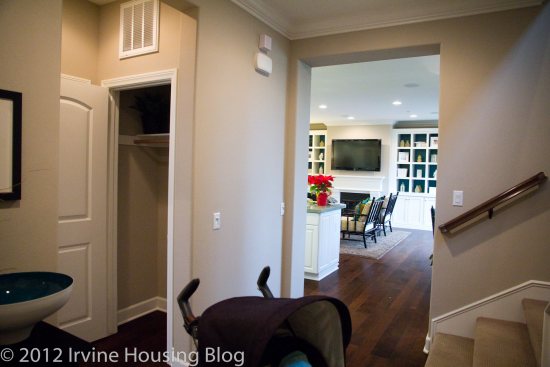
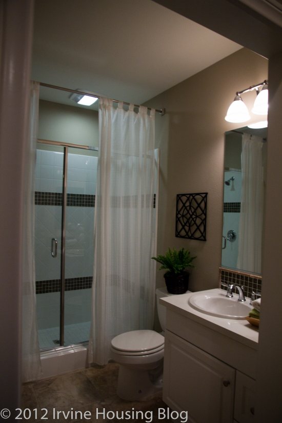
To the left, an entry to the first bedroom and ¾ bathroom (no tub but very nicely finished shower). The bedroom is a decent size and faces the front of the house.
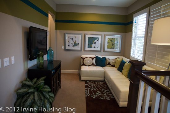
Past the bedroom and stairs is a great room that I really liked. It includes a kitchen with a large island spilling over into a family room with a dining area off to the side. The family room and dining area are lined with windows and since there are no walls separating these areas, they really add light to the space. The kitchen didn’t have a walk-in pantry but the cabinet space and counter space seemed ample and I likes me some space in the kitchen.
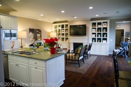
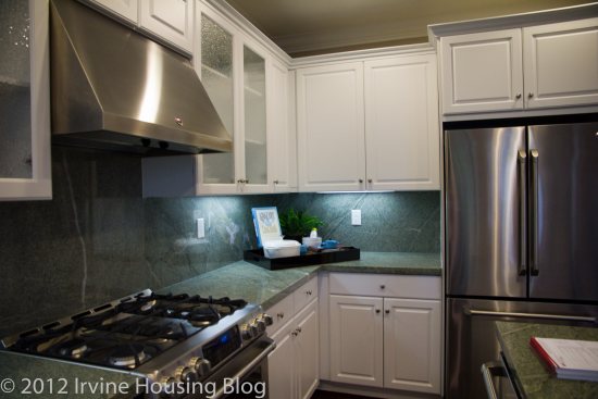
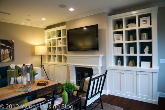
Whoever decorated this model did an outstanding job. I walked into that room and thought, “Wow. This is a space I’d love to live in.” It felt big and I liked it! But then I kept looking…
On the other side of the great room is the home management (?) center (fancy term for a couple desks along the wall) in a skinny corridor followed by a utility room. The utility room is also long and skinny; the washer and dryer are lined up along one wall and had a sink on one side and a counter on the other. Beyond that is the door to a side by side two car garage.
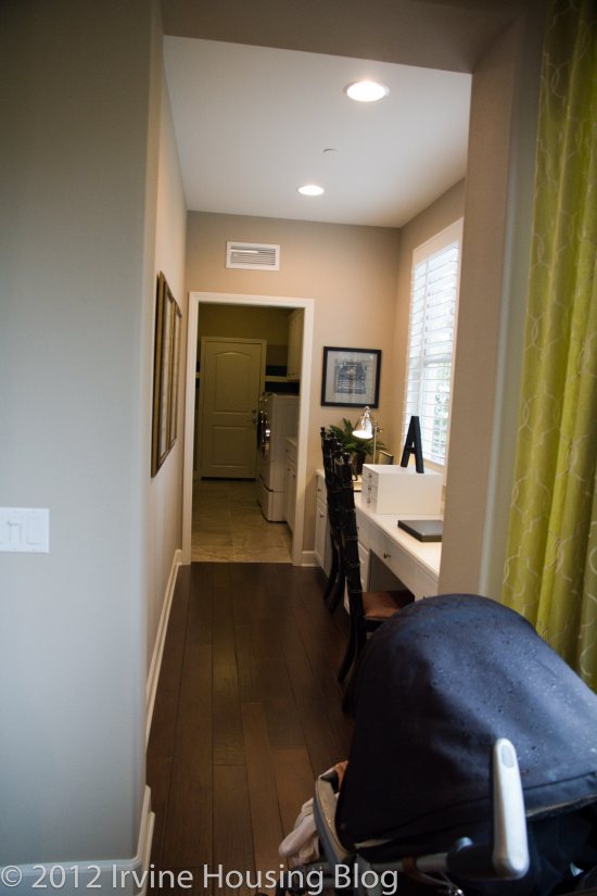
The garage had additional space for storage. Did I mention it was a side by side garage? Sorry, that really appeals to me because our current garage is tandem and I am amazed at the ways my body has contorted to get in and out of our car. But back to this model.
Off to the side of the living space is a small (and I do mean small) courtyard. I found this disappointing. For 2074 square feet; it would be nice to see more outdoor space and in the description I had read before visiting, it seemed like there would be some space for a little one to play around in. Well, at least the little one could stand around out there.
Despite the airiness of the great room, the layout of the home gives a slightly awkward feel upon entry because it is obvious that the home is long and thin, which reminds you that the layout is a condo. It’s clear that the design was meant to fit this condo mold, rather than a home that was designed in an ideal way. The more I thought about it, the more I realized that the decor was what I liked, not the home. It's actually kind of like a submarine, long and skinny.
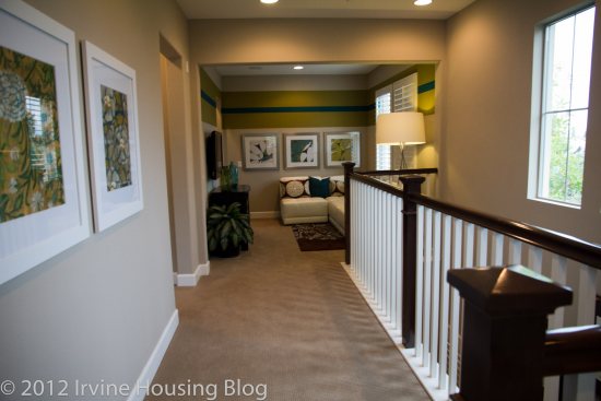
On to the second floor! At the top of the stairs, there is another awkward view of the long skinny floor plan. When I saw the plan on paper, the space seemed more awkward than it did in reality but it's still strange.
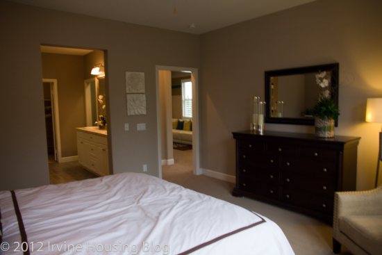
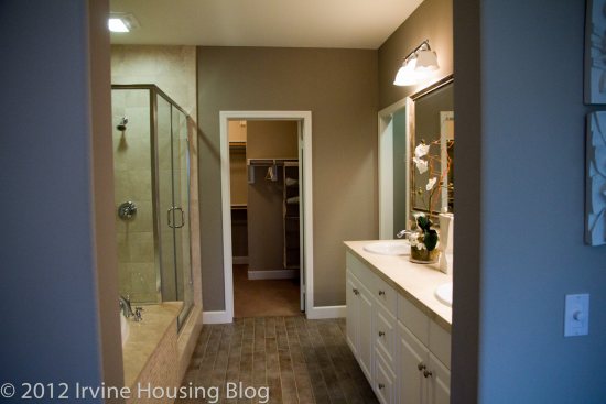
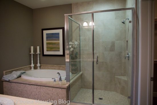
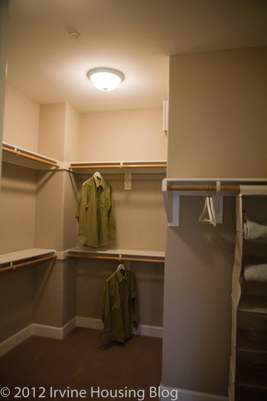
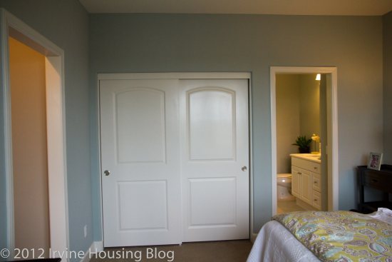
The master bedroom was a decent size with a nicely upgraded bathroom attached. The shower stall is large and the model had attractive earthen tiles next to a full sized tub. Beyond the bathroom is a nice square walk-in closet. The master also has a Juliet’s balcony that didn’t really add to the bedroom in my opinion. Maybe if there was a view, or an area to sit, it would make more sense. Or maybe if we were in Verona, and there was a gentleman calling, it would make more sense. In this place, it didn’t. All in all the master was nice but not particularly outstanding.
The loft wasn’t huge – the designer had placed a flat screen on the wall but the space seemed small for that. It might serve well as a playroom or hobby studio.
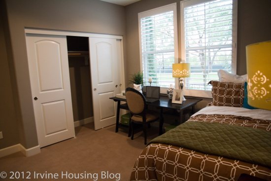
Off of the loft is a linen closet and the third bedroom. The third bedroom was larger than I expected. This full bath was also nicely furnished and the space itself is pretty good and didn’t feel cramped.
Here are some of the pros and cons to this model as I see ‘em:
Pros:
• Large rooms
• Great room is open and airy
• Side-by-side garage
• Pricing is decent compared to other homes of this size
• Corner unit (only share one wall)
• None of the living space is above or below anyone else’s unit
Cons:
• Long, skinny plan is awkward
• Very small outdoor space
• Bedroom downstairs is not ideal for families with multiple young children (although if your in-laws are visiting, this might be a pro!)
• No powder room for guests
While there were some really nice things about this home, it wouldn't be a fit for our family. Have you visitied Esplanade? What do you see as the pros and cons?
One thing I liked about the location of Esplanade is that the pools at the Commons and the retail at the Town Center are very close by. On the flip side, I don’t like the idea of the homes being on City Stroll (although it doesn’t seem like there is much traffic there).
On the Plan 4, having the third bedroom downstairs facing City Stroll was a deal breaker. I would have preferred the third bedroom to be upstairs with the other two.